
Quick Answer
A curve grade calculator adjusts raw test scores with a chosen method: the square root curve (√raw × 10) turns a 76 into an 87.2, a flat add gives every score the same boost, best-score lifts the whole class so the top mark becomes 100, and a bell curve assigns letters by class rank. Paste an entire class to get curved scores, letter grades, class average and pass rate in one shot.
Curve Grade Formulas (All Four Methods)
Every method in this calculator uses one of these four formulas — nothing else is mixed in, so you can check any result by hand:
| Method | Formula | Who gains most | Can it lower a score? |
|---|---|---|---|
| Square root | curved = √raw × 10 | Low scorers — the boost peaks at exactly +25 points for a raw 25 | Never (on a 0–100 scale) |
| Flat add | curved = raw + N (capped at 100) | Everyone equally | Yes, if N is negative |
| Best score → 100 | curved = raw + (100 − top raw score) | Everyone equally — the topper sets the lift | Never |
| Bell curve | rank → letter by distribution → A=95, B=85, C=75, D=65, F=50 | Depends entirely on class rank | Yes — points are replaced, not added |
Square Root Curve Chart (Raw → Curved)
The square root curve is the one students search for after a brutal exam. It compresses the scale upward: the lower the raw score, the bigger the lift. Letters below use the default 90/80/70/60 scale — adjustable in the calculator.
| Raw score | Curved (√raw × 10) | Gain | Letter |
|---|---|---|---|
| 10 | 31.6 | +21.6 | F |
| 20 | 44.7 | +24.7 | F |
| 25 | 50 | +25 (maximum possible boost) | F |
| 30 | 54.8 | +24.8 | F |
| 36 | 60 | +24 | D |
| 40 | 63.2 | +23.2 | D |
| 49 | 70 | +21 | C |
| 55 | 74.2 | +19.2 | C |
| 60 | 77.5 | +17.5 | C |
| 64 | 80 | +16 | B |
| 70 | 83.7 | +13.7 | B |
| 76 | 87.2 | +11.2 | B |
| 80 | 89.4 | +9.4 | B |
| 81 | 90 | +9 | A |
| 85 | 92.2 | +7.2 | A |
| 90 | 94.9 | +4.9 | A |
| 95 | 97.5 | +2.5 | A |
| 100 | 100 | 0 | A |
How to Use the Curve Grade Calculator
- Pick a mode.
My score curves one test result — the “what’s my 76 after the curve” question. Whole class curves every student at once and is built for teachers.
- Enter the score, or paste the class.
Single mode takes your score and the test’s maximum (a 19/25 works fine). Class mode accepts scores separated by commas, spaces or new lines — and names are optional, so “Alice 75” and “Bob: 82” both work.
- Choose the curve method.
Square root, flat add or best-score in single mode; class mode adds the rank-based bell curve with Standard (10·25·30·25·10), Strict and Generous presets, or a fully custom A–F distribution.
- Read the results — and export them.
Single mode shows the curved grade, letter and points gained. Class mode shows curved average, pass rate, an A–F histogram and a per-student table with rank and percentile — copy just the curved scores or the full table as CSV for your gradebook. The letter scale (default A 90+ · B 80 · C 70 · D 60) is editable too.
Worked Example: One Class, All Four Curves
Here is the same 10-student class (raw average 69.4) pushed through every method — something a one-method curve calculator can’t show you. Every number comes from the formulas above; paste these scores into the calculator to reproduce the table.
| Raw | Best score → 100 (+9) | Square root | Flat +5 | Bell (Standard) |
|---|---|---|---|---|
| 42 | 51 | 64.8 | 47 | 50 (F) |
| 55 | 64 | 74.2 | 60 | 65 (D) |
| 58 | 67 | 76.2 | 63 | 65 (D) |
| 63 | 72 | 79.4 | 68 | 65 (D) |
| 68 | 77 | 82.5 | 73 | 75 (C) |
| 71 | 80 | 84.3 | 76 | 75 (C) |
| 76 | 85 | 87.2 | 81 | 75 (C) |
| 82 | 91 | 90.6 | 87 | 85 (B) |
| 88 | 97 | 93.8 | 93 | 85 (B) |
| 91 | 100 | 95.4 | 96 | 95 (A) |
| Mean 69.4 | 78.4 | 82.8 | 74.4 | 73.5 |
Three things jump out. The square root curve lifts the class average the most (69.4 → 82.8) and helps the 42 more than the 91 — +22.8 versus +4.4. Best-score is the most transparent: the top student was 9 points short of 100, so everyone gets +9. And the bell curve is the only method that moves scores down: the 88 drops to 85 and the 76 slips to 75, because a forced distribution replaces points with rank — with 10 students on the Standard preset, exactly 1 gets an A and 1 gets an F, no matter how well the class did.
Which Curve Method Should a Teacher Use?
There is no universally “correct” curve, but each method has a clear use case — and a failure mode you should know before the grades go out. (All computation happens in your browser; pasted scores are never uploaded or stored.)
| Situation | Best method | Why |
|---|---|---|
| The exam was much harder than intended | Square root | Biggest help at the bottom, no one is lowered, a 100 stays a 100 |
| A few questions were broken or untaught | Flat add | Adding the value of the bad questions preserves every gap between students |
| Nobody reached 100 and you want a defensible rule | Best score → 100 | Adam Grant’s own rule: “never curve downward, only upward” — if the top mark is 83, everyone gets +17 |
| Department requires comparable grade distributions across sections | Bell curve | Norm-referenced grading keeps A–F percentages consistent year to year (Johns Hopkins), at the cost of making grades zero-sum |
How Bell Curve (Norm-Referenced) Grading Works
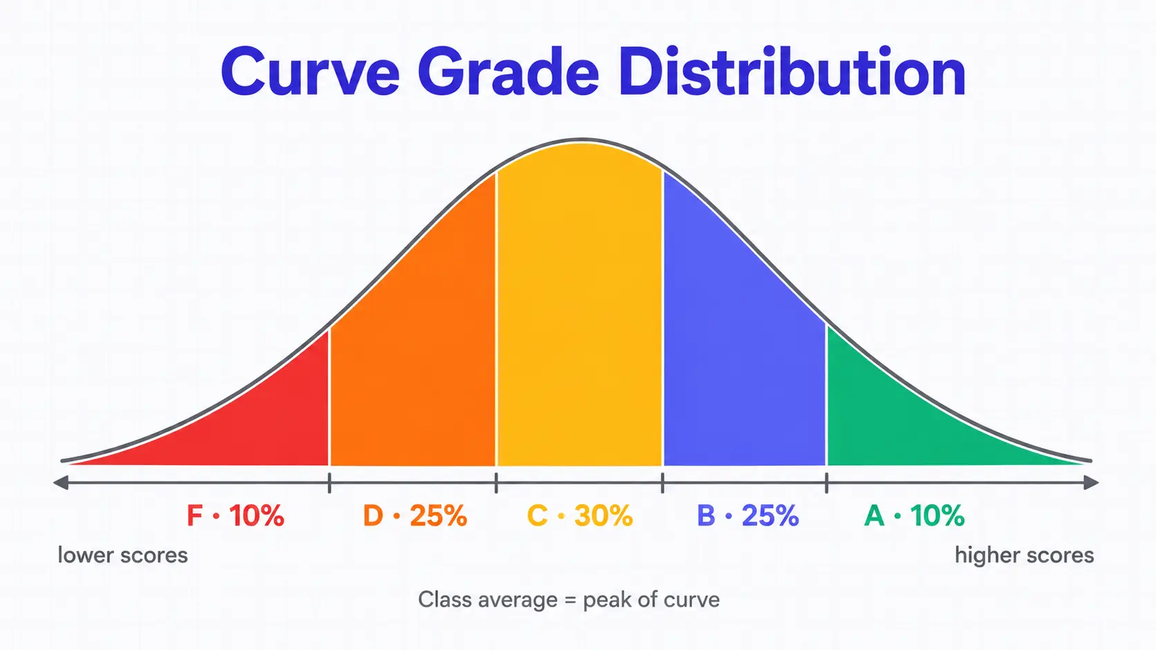
“Grading on a curve” in the strict sense means norm-referenced grading: students are ranked, the ranking is sliced into a target A–F distribution, and each slice gets the letter — regardless of raw points. The calculator’s presets are Standard (10% A · 25% B · 30% C · 25% D · 10% F, a rough normal shape), Strict (5·20·30·30·15) and Generous (15·30·30·20·5), and any custom split that sums to 100% works. Each letter then maps to a numeric score for averaging: A = 95, B = 85, C = 75, D = 65, F = 50. Tied raw scores share the higher letter, so a tie on a boundary can push that letter slightly past its preset share. The per-student table shows rank and percentile — computed as (students below + half of ties) ÷ class size × 100 — so you can see exactly why each score landed where it did. Tracking a longer academic pipeline instead? The CASPA science GPA calculator and APUSH score calculator handle grade aggregation on the admissions side.